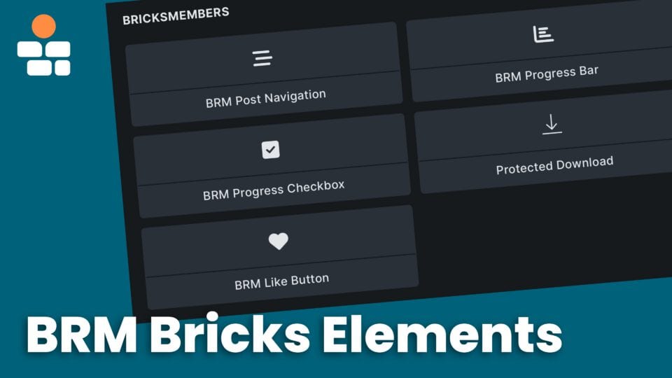
BricksMembers now adds a much broader Bricks Builder surface than the original five learning elements. Today the plugin includes core learning elements, quiz and survey elements, member chat elements, certificate, video, and SCORM elements, the Payments checkout suite, and a few enhancements to native Bricks elements such as form actions.
Not every element appears on every site. BricksMembers registers elements conditionally. Bricks itself must be active, and the relevant BRM module must be enabled. BRM Post Navigation is always available. BRM Progress Checkbox and BRM Progress Bar need Progress Tracking. Protected Download needs Protected Downloads. BRM Like Button needs Like System. The quiz elements need Quizzes/Surveys. BRM Certificate PDF needs Certificates. The chat elements need Member Chat. BRM Video needs Video Tracking. SCORM Player needs SCORM. BRM Event Calendar needs Events. The billing and checkout elements need Payments.
Current BricksMembers Elements in Bricks
Here is the current element catalog as of this version of BricksMembers.
- Always available: BRM Post Navigation for previous/next links inside your structure.
- Progress Tracking module: BRM Progress Checkbox and BRM Progress Bar.
- Protected Downloads module: Protected Download.
- Like System module: BRM Like Button.
- Quizzes/Surveys module: BRM Quiz, BRM Quiz Answer Layout, BRM Quiz Answer Selector, BRM Quiz Text Answer, BRM Quiz Matching Area, BRM Quiz Sortable List, BRM Quiz Drag Item, BRM Quiz Drop Zone, and the compact BRM Quiz Answer Input.
- Certificates module: BRM Certificate PDF.
- Member Chat module: BRM Chat Feed, BRM Chat Input, and BRM Chat Room List.
- Video Tracking module: BRM Video.
- SCORM module: SCORM Player for launching assigned SCORM Cloud lessons.
- Events module: BRM Event Calendar for month, week, list, and year event discovery surfaces with member actions.
- Payments module: BRM Billing Action, BRM Checkout Context, BRM Checkout Provider Selector, BRM Checkout Fields, BRM Checkout Payment Form, BRM Checkout Consent, BRM Checkout Trigger, and BRM Checkout Error Surface.
- Native Bricks form actions: BRM adds Assign User Levels plus module-gated Bricks Form actions for gifting, enrollments, member profile/account forms, submissions, groups and team licenses, quizzes, certificates, and instructor frontend builder workflows.
BRM Video includes a Video source context control. Use Current post for regular lesson templates. Use Current query loop item when the element is inside a Bricks post query loop and each card should play and track the loop item’s own saved video source. Since version 1.3.0, playback is allowed by default for anyone who can see the element; use the element’s Playback Access controls only when the player itself should be blocked by logged-in state, selected user levels, post required levels, enrollment, prerequisites, or drip.
SCORM Player launches the SCORM Cloud package assigned to the current post. Use it on lesson pages after importing a SCORM ZIP in BricksMembers → SCORM and assigning the package to that lesson. The launch button supports the shared BricksMembers button style and size controls, including AutomaticCSS button style and size options. Do not paste SCORM Cloud launch URLs into Bricks content; launch URLs are created per learner registration by BricksMembers.
BRM Checkout Fields is the canonical element for checkout inputs. Use it inside BRM Checkout Context to add buyer email, first name, last name, company name, address, separate billing details, tax/VAT fields, group name, native gift fields, and optional checkout-enabled profile fields. Each instance has an ordered field list similar to the Bricks form element: choose the field source, choose the concrete field, and optionally override its label, placeholder, or help text. You can place contact fields, billing fields, tax fields, group fields, gift fields, and selected profile fields in different Bricks containers or steps. BricksMembers merges all instances into one checkout payload. Country controls show readable names such as “Germany (DE)” while submitting ISO country codes, and supported countries can expose a region/state dropdown. Stripe uses the billing details for an estimated on-page tax summary before Stripe Checkout confirms final tax; one-time PayPal and Square use the same details as pre-checkout tax input. Use checkout helper tags such as {brm_checkout:tax_b2b_toggle_label}, {brm_checkout:tax_vat_id_label}, and {brm_checkout:tax_reverse_charge_notice} for custom visible copy.
If your checkout design has a separate order summary, add data-brm-checkout-summary-subtotal, data-brm-checkout-summary-tax, and data-brm-checkout-summary-total to the text elements that should receive the calculated amounts. The checkout runtime updates subtotal and total from the selected BRM checkout currency immediately, then updates tax and total from the tax preview response when BRM-side tax preview is active.
BRM Checkout Provider Selector keeps the provider options generated by BricksMembers, but it is still styleable in Bricks. Use its content controls to choose buttons or a select field, change the visible Stripe, PayPal, or Square button text, show official SVG provider marks, or upload your own mark image for each provider. Use its style controls for the generated buttons, marks, and select field. When you choose AutomaticCSS, BRM adds the matching btn, btn--*, and size utility classes to the internal provider buttons; when you choose a normal button style, BRM also adds Bricks button utility classes such as bricks-button, bricks-background-primary, and bricks-button-lg.
Checkout profile fields live inside BRM Checkout Fields. Add a field row with the source set to Profile field, then select the specific profile field that should appear in that position.
Gift checkout fields also live inside BRM Checkout Fields. Add gift rows for the purchase toggle, recipient email, recipient first name, recipient last name, and optional message.
BRM Checkout Payment Form renders secure provider containers instead of nestable children. That is intentional: Stripe card fields, PayPal buttons, and Square previews need to stay under the checkout runtime so the payment flow remains safe. Use the element’s style controls to adjust the generated provider surface, preview fields, spacing, border, and radius.
If you need the full setup details for the newer module-specific elements, jump to the dedicated guides: Building Quizzes, Certificates and Achievements, Payments Module and Billing, Video Tracking and the BRM Video Element, Member Chat and Community Rooms, and Events, Webinars, and Coaching.
The Core Learning Elements Covered in Detail
Let users mark content as complete
Show visual progress indicators
Navigate between posts with structure-based boundaries
Display secure download links with access control
Let users like/unlike posts with count display
Run BRM actions from native Bricks forms
The core learning elements are native Bricks elements. They appear in the Bricks element panel in the BricksMembers section and work like any other Bricks element. The module-specific elements listed above follow the same pattern, while BRM form actions live inside the native Bricks Form element and appear when their owning module is active.
Progress Checkbox Element
Important: This element only shows up in the Bricks elements list if progress tracking is turned on!
The Progress Checkbox lets users mark posts as complete and optionally automate what happens next.
When to Use It
Perfect for:
- Course lessons (mark as complete when finished)
- Onboarding steps (check off completed tasks)
- Reading lists (track which articles you’ve read)
Not needed for:
- Blog posts (no completion tracking)
- Static pages (no progress to track)
- Sales pages (not member content)
Adding a Progress Checkbox
- Edit a post template in Bricks (for posts within content structures)
- Find the BricksMembers Progress Checkbox element in the element panel
- Drag it to your desired location (usually at the bottom of the content)
- Configure the settings (see below)
- Save the post
Settings
Label
- Text shown when unchecked
- Default: “Mark as complete”
- Examples: “You’ve finished this lesson,” “Done,” “Complete”
Checked Label
- Text shown when checked
- Default: “Completed ✓”
- Examples: “Done! ✓,” “Finished,” “Completed”
Style
- Show as button (Content tab)
- Typography: Font, size, weight, color
- Spacing: Padding, margin
- Colors: Text color, background color, border color
- States: Different styles for unchecked, checked, hover
- Bonus: Button Style tab:
- We all love AutomaticCSS, so in the Button Style tab, you can select AutomaticCSS under Button Style and then use the appearing selects to choose the button style and sizes
- The correct ACSS utility classes are automatically applied to the button
Events (Advanced)
- Reload Page After Completion: Automatically reload the page after marking as complete
- Open Next Post After Completion: Automatically navigate to the next post in the structure
- On 100% Completion Redirect: When the user completes all items in a boundary, redirect to a page, reload, or use partial/full page refresh, useful for congratulations pages, certificates, or updating the page without leaving
- Drip Unlock Behavior: (When Drip Content is enabled) Choose how the page reacts when a drip unlock happens, AJAX partial refresh, full page reload with scroll restore, or no change. See the Drip Unlock Behavior section below for setup.
Advanced: Automating the Learning Flow
The Progress Checkbox includes powerful automation options to create seamless learning experiences.
Option 1: Reload Page After Completion
What it does:
- Automatically reloads the page after the user marks content as complete
- Updates progress bars and unlocks new content immediately
- Works great with drip content that unlocks based on completion
When to use it:
- You have progress bars on the same page
- You’re using drip content that unlocks after completion
- You want users to see their updated progress and unlocked posts immediately
Option 2: Open Next Post After Completion
What it does:
- Automatically navigates to the next post in your structure
- Creates a seamless “Netflix-style” learning flow
- You can set boundaries with “Next Post Boundary” control (e.g., stay within the current course)
When to use it:
- You want users to move through content sequentially
- You’re building a course with a clear learning path
- You want to reduce friction (no need to click “Next”)
Settings:
- Next Post Boundary: Choose which boundary to stay within (Top Level, Parent Level, or specific levels)
100% Completion Redirects
What it does:
When a user completes the last item in a boundary (e.g., finishes all lessons in a course), you can redirect them to a specific page.
Redirect Options:
- No redirect: Default behavior (reload or next post)
- Reload page: Refresh the current page
- Go to parent post: Navigate to the course overview page
- Internal post/page: Send them to a specific congratulations page
- Custom URL: Redirect to any URL (e.g., certificate page, external site)
- Update matched wrappers (AJAX): Partial refresh, update specific sections in place without leaving the page. Same setup as After Progress Change (CSS selectors, Bricks element IDs). See Partial Page Refresh.
- Reload page with position: Full refresh, reload the page and restore scroll position or scroll to a target element. Same options as After Progress Change.
Example Use Case:
Set up “Open Next Post After Completion” with a 100% completion redirect to a congratulations page. Users will automatically move through lessons, and when they finish the last lesson, they’ll be redirected to a completion page with a certificate download.
Settings:
- Check Completion For: Choose which boundary must reach 100% (Top Level, Parent Level, or specific levels)
Drip Unlock Behavior (Instant Unlock UX)
Important: Drip Unlock Behavior controls only appear when the Drip Content module is enabled.
When learners complete a lesson, waiting for a full page reload can feel clunky. The Drip Unlock Behavior controls let you choose how the page reacts when a drip unlock happens, so newly available content can update right away.
After a user checks the Progress Checkbox, BricksMembers can react in three ways:
- Do nothing – Save completion only; no page change
- Update matched wrappers (AJAX) – Re-render matching sections in place without reloading the page
- Reload page with position – Refresh the page, then restore scroll position or jump to a target element
When to use which mode:
- Update matched wrappers (AJAX) – Smooth in-place update. Best when you want an unlock panel to switch from “Locked” to “Continue” without a page refresh.
- Reload page with position – When the page has many dynamic sections that should all reflect the new state at once.
- Do nothing – When completion should be recorded silently and UX changes happen elsewhere (e.g., on next visit).
Prerequisites: Enable Progress Tracking and Drip Content in BricksMembers → Modules. Add a BRM Progress Checkbox to your lesson template. For AJAX mode, you need at least one wrapper element on the page that you want to refresh after unlock.
Setup: Partial Refresh (AJAX) , Step by Step
Partial refresh re-renders specific sections of the page via AJAX, so locked/unlocked content can update without a full reload.
- Edit your page or post template in Bricks Builder
- Select the BRM Progress Checkbox element on the canvas
- In the panel, open the Drip Unlock Behavior control group
- Set After Drip Unlock to Update matched wrappers (AJAX)
- Prepare your wrapper element(s): Each section you want to refresh must be inside a wrapper (e.g., a Section or Div). Select that wrapper in Bricks and give it a CSS class or custom ID so it can be targeted:
- To add a class: In the wrapper’s settings, open Advanced → CSS Class(es) and add something like
drip-refresh - To add a custom ID: In the wrapper’s settings, open Advanced → CSS ID and add something like
next-lesson-panel - Inside the wrapper, add child elements for locked and unlocked states, and use Bricks conditions (BricksMembers → Drip → is Locked / is Unlocked) to control visibility
- Important: Don’t put conditional logic on the wrapper element as otherwise it won’t work!
- To add a class: In the wrapper’s settings, open Advanced → CSS Class(es) and add something like
- Enter the CSS Selector: In the Progress Checkbox’s Drip Unlock Behavior, enter a selector that matches your wrapper(s). Examples:
.drip-refresh, targets elements with classdrip-refresh#next-lesson-panel, targets the element with IDnext-lesson-panel- For multiple wrappers, separate selectors with commas:
.drip-refresh, #my-unlock-panel
- Enter the Bricks Element IDs: Bricks assigns a 6-character ID to each element. To find it: select the wrapper in the canvas, then look at the input field on top of the settings panel on the left side of the Bricks editor. You’ll see something like
#brxe-yydnul. The part after#brxe-is the element ID (e.g.yydnul). Enter this in the Bricks Element IDs field. The order must match the order of your CSS selectors:
- If your CSS Selector is
.drip-refresh, #next-lesson-panel, then Bricks Element IDs might beabc123, def456(first ID for first selector, second for second) - For multiple IDs, separate with commas (no spaces)
- If your CSS Selector is
- Save. When a learner completes content and a drip unlock happens, BricksMembers will re-render the matched wrappers via AJAX. The server returns fresh HTML with updated condition results, so locked/unlocked content updates in place.
Scroll & Highlight (optional): After the AJAX refresh, you can scroll to the first refreshed element and/or highlight it. Enable Scroll to Element to smoothly scroll it into view, and Highlight Element to apply a visual effect (Border, Glow, Background, Shine, etc.). You can configure Highlight Padding, Shine Speed, Duration, and Color.
Setup: Full Refresh Mode , Step by Step
Full refresh reloads the page so all sections reflect the new state, then either restores scroll position or jumps to a target.
- Select your BRM Progress Checkbox in Bricks
- Open Drip Unlock Behavior and set After Drip Unlock to Reload page with position
- Choose Position Restore:
- Restore exact scroll position , returns the user to where they were before the reload
- Scroll to element , jumps to an element matching a CSS selector (e.g.
.brm-unlock-section). Add that class or ID to your target element in Bricks
- If you use “Scroll to element”, optionally enable highlight so the target is visually emphasized after the jump
How AJAX mode stays accurate: With partial refresh, BricksMembers asks the server for the current state each time it re-renders. It does not blindly force “unlocked” on the client. That matters when time conditions or prerequisites still block access, the server returns the correct state.
Common mistakes:
- No Drip Conditional element on the page , AJAX mode has nothing to refresh. Make sure you have wrapper(s) with locked/unlocked child content
- Wrong container selector , The CSS Selector must match the class or ID you added to your wrapper. Double-check spelling and format (e.g.
.classvs#id) - Bricks Element ID does not match , The ID must be the 6-character code for the wrapper element. Get it from the input field on top of the settings panel when the wrapper is selected. Order of IDs must match order of CSS selectors
- Missing locked/unlocked states , Create child blocks for both states inside the wrapper, with Bricks conditions controlling visibility
- Drip rules not matching content , Verify post type, structure, level, and prerequisite settings in your drip rules
Quick test checklist: Complete a lesson as a test user; confirm completion saves; confirm newly unlocked content appears (AJAX) or page reloads to the expected position (full mode); repeat with a second lesson to confirm chain behavior.
These same controls are also documented in Drip Content under the Making Unlocks Feel Instant section, for users configuring drip behavior.
Best Practices
Do:
- Place at the bottom of content (after users have read/watched)
- Use clear, action-oriented labels
- Style to match your design
- Show only to logged-in users – anything else could cause problems
- Use “Open Next Post” for sequential learning paths
- Set up 100% completion redirects for course completion pages
Don’t:
- Forget to enable Progress Tracking module first (element won’t appear)
- Use confusing labels (“Click here”)
- Place in the middle of content (distracting)
Progress Bar Element
Important: This element only shows up in the Bricks elements list if progress tracking is turned on!
The Progress Bar shows visual progress indicators.
When to Use It
Perfect for:
- Member dashboards & course overview pages (progress per course)
- Course pages (indicate progress)
- Module pages (progress within a module)
- Wherever you want to show progress visually
Adding a Progress Bar
- Edit a page, post or post template in Bricks (e.g., your member dashboard)
- Find the BricksMembers Progress Bar element
- Drag it to your desired location
- Configure the settings and style it (see below)
- Save the page
Settings
Progress Calculation Mode
Select between auto, manual, quiz, and video mode. Manual gives you the option to insert a post id (eg. for a specific course), while auto lets you choose the progress based on parent (eg. progress within current course or module). Since version 0.9.94, quiz mode can show question navigation progress inside a quiz template, and video mode can show video-watch progress when Video Tracking is enabled. In video mode, the Video Progress Value control lets the bar show stored watched coverage or the live player position.
User Context
Since version 1.1.0, the Progress Bar can keep its default Auto user context and resolve the loop/profile user inside Bricks user query loops, including loops filtered by Users: Group Membership, and BricksMembers profile pages. This is useful for group dashboards where a parent, coach, leader, or manager should see another member’s progress. BricksMembers checks privacy and group-role permissions first. Set User Context to Current User for self-dashboard layouts that should never switch to another user.
Progress Level (if auto mode is used)
Select the level to show progress for (e.g., Top Level for course progress, even if viewing a lesson).
- Structure: Shows average progress across all top-level posts in the structure.
- Top Level: Shows progress for the top level post (usually the course). Use this when you want to display overall course progress, even if you’re on a lesson or module page.
- Parent Level: Shows progress for the direct parent of the current post (e.g., current module if you’re on a lesson post that’s a child of a module post). Use this to show module progress when viewing a lesson.
- Current Level: Shows progress for the current post itself. Use this when viewing a post that has children (e.g., a course or module page) to display progress for that specific post. Perfect for showing course progress when on a course page, or module progress when on a module page. This does not work on the progress tracking level!
- Level 2, Level 3, etc.: Progress of a specific level
Show Percentage
- Yes: Display percentage text (e.g., “75%”)
- No: Show only the bar
Style
- Height: Bar thickness
- Colors: Background color, fill color, text color
- Border Radius: Rounded corners
- Gradient: Gradient background
Styling note: The Progress Bar uses normal Bricks style controls and generated Bricks CSS. If you need to tweak the internal layout behavior, enable Show Structural Controls to reveal the advanced layout controls that are hidden by default.
Examples
Example 1: Course Progress on Course Catalog Page
Show progress bars in a course list for the user to see his progress instantly.
- Progress Calculation Mode: Auto
- Level: Top Level
- Show percentage: Yes
- Style: Up to you
- Placement: Inside a Query Loop that lists courses / posts of your top level post type
Example 2: Parent Progress Bar in the header of all posts
Show a progress bar in the hero section of all posts within a structure that always shows the progress within the parent post.
- Progress Calculation Mode: Auto
- Level: Parent Level
- Show percentage: Yes
- Style: Up to you
- Placement: Above lesson content – ideally in the header
- Make the hero section a Bricks component and include it in all your post templates
The progress bar will automatically detect the progress within the parent post, eg. progress of the module if you’re on a lesson post, progress of the course, if you’re on a module post.
Alternatively: Set it to top level to always show the progress within the current course in the header.
Best Practices
Do:
- Use on dashboards and overview pages
- Don’t worry about performance in listings as the reads are fast and well optimized
- Show percentage for clarity
Don’t:
- Forget to enable Progress Tracking module first (element won’t appear then)
- Show on every single page (it’s distracting)
- Mix scopes confusingly (e.g., module bar next to course bar without labels)
Post Navigation Element
The Post Navigation element shows next/previous links within a structure.
When to Use It
Perfect for:
- Course lessons (next lesson, previous lesson)
- Sequential content (step-by-step guides)
- Structured learning paths
Not needed for:
- Blog posts (use standard Bricks Post Navigation element)
- Non-sequential content
Adding Post Navigation
- Edit a post template in Bricks (for posts within content structures)
- Find the BricksMembers Post Navigation element
- Drag it to your desired location (usually at the bottom)
- Configure the settings (see below)
- Save the post
Settings
Type
- Both: Show previous and next post links
- Previous: Show only the link to the previous post
- Next: I’m sure you can guess that ;-)
User Level Match, Progress & Drip Filters (optional)
Select any of these filters to show only previous and next links to content the user has access to based on his user level and drip logic, or that he has or has not completed.
Navigation Boundary
- Top Level: Navigate within the top level post (eg. course)
- Parent Level: Navigate within the current parent post (e.g., module of current lesson)
- Level 2, Level 3, etc.: Navigate within parent post of a specific level
Labels
- Previous Label: Text for previous link (e.g., “← Previous Lesson”)
- Next Label: Text for next link (e.g., “Next Lesson →”)
Title
- Show Title: Enable/disable post title display (default: enabled)
- Title Tag: HTML tag for the title (default: h5)
- Title Typography: Font, size, weight, color (Style tab)
Arrows
- Show Arrows: Enable/disable arrow icons (default: enabled)
- Previous Arrow Icon: Custom icon for previous link (icon picker)
- Next Arrow Icon: Custom icon for next link (icon picker)
- Arrow Typography: Font size and color for arrows (Style tab)
Image
- Show Image: Enable/disable featured image display (default: disabled)
- Image Size: WordPress image size (default: thumbnail)
- Image Height: Height of the image (Style tab, default: 60px)
- Image Width: Width of the image (Style tab, default: 60px)
- Image Border: Border styling for images (Style tab)
- Image Border Radius: Rounded corners (default: 4px)
- Image Object Fit: How image fills container (default: cover)
Examples
Example 1: Simple Next/Previous
- Boundary: Top Level (eg. within same course – posts within other courses will be ignored)
- Progress filter: All
- Show both previous and next
- Labels: “← Previous” and “Next →”
- Style: Up to you
Example 2: Next Lesson Only
- Boundary: Top Level (across entire course)
- Progress filter: Not Completed (skip completed lessons)
- Type: Next
- Label: “Continue to Next Lesson →”
- Style: Up to you
Best Practices
Do:
- Place at the bottom of content (natural progression point)
- Use clear labels (“Next Lesson” not just “Next”)
- Match boundary to user intent
Don’t:
- Use on non-structured content – Use the native Bricks Post Navigation element in that case
Protected Download Element
Important: This element only shows up in the Bricks elements list if the protected downloads module is turned on!
The Protected Download element displays secure download links that respect each download’s configured access mode: required user levels or, since BricksMembers 1.4.0, Specific Users backed by the Enrollments module.
When to Use It
Perfect for:
- Course materials (PDFs, worksheets, templates)
- Resource libraries (downloadable files for members)
- Bonus content (exclusive downloads for specific levels)
- Product files (digital products with access control)
Not needed for:
- Public downloads (use regular links)
- Non-member content
- More customized solutions – use
{brm_download}tags for that
Adding a Protected Download
- Edit a page, post or template in Bricks
- Find the Protected Download element in the element panel
- Drag it to your desired location
- Configure the settings (see below)
- Save the page
Settings
Display Mode
- Single Download: Show one specific download
- Downloads List: Show multiple downloads
Download Source
- Selected download / manual list: Choose one download in Single mode, or use the manual list in Downloads List mode
- Downloads assigned directly to current user: Use accessible published downloads assigned to the logged-in viewer through direct download enrollments; logged-out and no-match views stay empty
- Downloads assigned to current post: Use downloads assigned to the current lesson, module, course, post, or current query loop item
- Downloads assigned to specific post ID: Enter a fixed post ID when the element should always reference another post
- Downloads assigned to current structure: Use downloads assigned to the current post’s structure
- Downloads assigned to specific structure ID: Enter a fixed structure ID when the element should always reference another structure
- Since version 1.1.12: Single Download mode uses the first assigned download in assignment order. Downloads List mode shows all downloads from the selected source.
List Settings (for List mode)
- Number of Downloads: How many to show (1-50)
- Hide Inaccessible Downloads: Hide downloads the current user cannot access through the complete download access check
- List Style: Bullet style (disc, circle, numbers, letters, etc.)
Display Options
- Show as Button: Display as button or link
- Button/Link Text: Custom text (or use filename/title)
- Use Filename as Text: Automatically use the file name
- Use Download Title as Text: Use the download’s title
- Show Download Title: Display the download title
- Show Filename: Display the file name
- Show File Size: Display file size (e.g., “2.5 MB”)
- Show Download Image: Display featured image if set
- Show Description: Display download description
Layout
- Layout Style: Default (vertical), or Horizontal
- Title Position: Top (above everything) or With Content
Button Style (when Show as Button is enabled)
- Button Style: Primary, Secondary, Light, Dark, Muted, or AutomaticCSS (ACSS utility classes get applied)
Examples
Example 1: Single Download Button
- Display Mode: Single Download
- Download: Course Materials
- Show as Button: Yes
- Button Text: “Download Course Materials”
- Show File Size: Yes
- Button Style: Primary
Example 2: Downloads List with Images
- Display Mode: Downloads List
- Number of Downloads: 10
- Show Image: Yes
- Layout Style: Horizontal
- Show Title, Filename, File Size: Yes
- Hide Inaccessible Downloads: Yes
Example 3: Show Downloads Assigned to the Current Lesson
- Assign one or more protected downloads to your lesson or other structure post in the post edit screen or in BricksMembers → Content & Structures → Quick Edit
- Add the Protected Download element to your lesson template
- Set Download Source to Downloads assigned to current post
- Choose Single Download to show the first assigned file, or Downloads List to show them all
Result: every lesson can show its own attached downloads without creating a separate element configuration for each download.
Since version 1.1.12: You can use the same element with downloads assigned to a whole structure. Assign the files from the structure interface header, then set Download Source to Downloads assigned to current structure or Downloads assigned to specific structure ID.
Account downloads: To list files assigned to each logged-in customer, set Download Source to Downloads assigned directly to current user. Direct assignments are managed in the Protected Downloads editor and require the Enrollments module.
Best Practices
Do:
- Use descriptive button/link text
- Show file size so users know what they’re downloading
- Filter by user level to hide inaccessible downloads
- Use assigned-download mode on templates when each lesson or post should show its own resources automatically
Don’t:
- Forget to enable Protected Downloads module first
- Show downloads users can’t access
Like Button Element
Important: This element only shows up in the Bricks elements list if the like button system module is activated!
The Like Button element lets users like or unlike posts with an optional count display. It can be used on any content. It must NOT be within any content structure. Let users like whatever they want.
When to Use It
Perfect for:
- Blog posts (let readers show appreciation)
- Course lessons (favorite lessons)
- Resource pages (bookmark useful content)
- Community content (show engagement)
- Community items when the separate Interactions module is enabled
Adding a Like Button
- Edit a post, page, or template in Bricks
- Find the BRM Like Button element in the element panel
- Drag it to your desired location
- Configure the settings (see below)
- Save the post
Settings
Content
- Post ID: Post to like (leave empty for current post)
Icon
- Icon Type: Default Heart or Custom Icon
- Custom Icon: Select custom icon (if Icon Type is Custom)
- Icon Size: Size of the icon
Display
- Show Count: Display the number of likes
- Count Position: Right of Icon, Left of Icon, or Below Icon
- Hide Zero Count: Hide count when it’s zero
Styling
- Icon Color: Color when not liked
- Icon Color (Liked): Color when liked
- Count Color: Color of the count text
- Icon/Count Gap: Spacing between icon and count
- Transition Duration: Animation speed
Examples
Example 1: Simple Like Button
- Icon Type: Default Heart
- Show Count: Yes
- Count Position: Right of Icon
- Hide Zero Count: Yes
- Icon Color: Gray (#ccc)
- Icon Color (Liked): Green (#00ff66)
Example 2: Custom Icon Like
- Icon Type: Custom Icon
- Custom Icon: Thumbs Up
- Show Count: Yes
- Count Position: Right of Icon
- Icon Size: 32px
A great way is also to use it in query loops to let users like posts.
Best Practices
Do:
- Show count to encourage engagement
- Use clear visual feedback (color change when liked)
- Place near content (top or bottom of post)
- Style to match your design
Don’t:
- Forget to enable Like System module first
- Use confusing icons
- Place in distracting locations
Form Action: Assign User Levels on Registration
BricksMembers adds a custom form action to Bricks forms that automatically assigns user levels when users register. This is perfect for free membership sites, associations, or any scenario where you want to grant access immediately upon registration.
To use this feature, add the Assign BRM User Levels action to your Bricks form after the User Registration action, then select the level(s) to assign in the BRM User Levels control group.
For complete setup instructions, example use cases, and important notes, see Understanding User levels (Method 4: Form Registration).
Element Availability
Progress Checkbox:
- Only available when progress tracking module is enabled
Progress Bar:
- Only available when progress tracking module is enabled
Post Navigation:
- Always available (doesn’t require any module)
- Works only with posts inside content structures – use the native Bricks Post Navigation Element if not
Protected Download:
- Only available when protected downloads module is enabled
Like Button:
- Only available when Like System module is enabled
If you don’t see an element, check that the required module is enabled in BricksMembers → Modules.
Common Questions
Q: Can I use these elements outside of Bricks?
A: No. They’re Bricks-specific elements. Use dynamic tags where applicable if you need more customization.
Q: Can I style elements with custom CSS?
A: Yes! Each element has CSS classes you can target either with controls, or custom css
Q: Do these elements work with Bricks templates?
A: Yes!
Q: Can I show different elements to different user levels?
A: Yes! Use Bricks conditions to show/hide elements based on user level.
Q: What if I delete an element? Is data lost?
A: No. Progress, completion, likes and downloads data is stored in the database and managed in the WordPress backend, not in the element. Delete and re-add elements freely.
Q: Can I have multiple progress bars on one page?
A: Yes! Show global progress, structure progress, and category progress all on the same page.
Build Community and Chat with Protected Media
Start with BRM Community Area, then place Community Items, Collection, Link, Composer, Search, Notifications, and native Bricks children inside it. Use Open Attachment Picker for uploads; BricksMembers creates a protected upload session and never saves a storage-provider URL in the element.
Add Create or Open Linked Chat only where you want an on-demand Chat room. Render structured mentions and references with the nestable BRM Mentions & References element inside the Item, Reply, or Chat message layout. Design its repeating children with {brm_relation:*} tags, and gate linked-room buttons with brm_community_has_chat_room, brm_community_can_open_chat, and brm_chat_has_community_context. Do not create custom upload, delivery, room, or relation endpoints.
